Icons
Ionicons
Ionicons is the primary source of icons. Search for an icon you want to use through the external Ionicons library and copy the web component code. For example:
<ion-icon name="alarm-outline"></ion-icon>
The icon size is set automatically based on the area it is being displayed. For use in rich text, the icon can be enlarged by setting the size attribute to large. Example:
<ion-icon name="alarm-outline" size="large"></ion-icon>
Custom SVG Icons
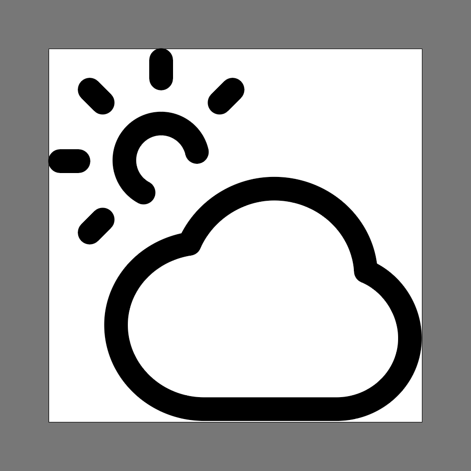
For consistency, the Ionicon SVGs can be downloaded as a zip file to look at how they're created. Their icons are 512x512 and use a 32px stroke.
Requirements
- Vector editing tool that supports SVG (e.g. Illustrator, Figma)
- Plain text editor (e.g. Notepad, Notepad++, TextEdit)
Steps
- Download an SVG or other vector icon file and open it in a vector editing tool.
- Convert all strokes to paths.
- For the site to appropriately apply color to the icon (based on themes), paths must be filled with pure black (#000000). When saving the SVG, most tools will ignore pure black and the site’s CSS is able to apply color to the icon. This will be verified in steps 8 and 9.
- Clean up the icon as needed and set the artboard size to match the icon with no extra space around the edges.
- Save the file as an SVG. Some tools will prompt you for settings. For example, these are the important settings in Illustrator:
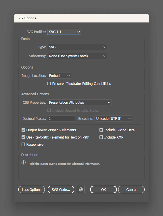
- SVG Profile: SVG 1.1
- Type: SVG
- More Options
- CSS Properties: Presentation Attributes
- Decimal Places: 2
- Responsive: Unchecked
- Open your new SVG file in a plain text editor.
- If there is a
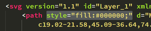
<style>tag in the code, verify that no colors have been specified, including pure black. Remove anyfill:styles.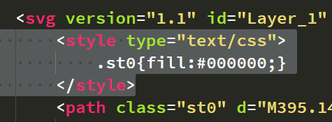
- Verify that there are no
fillorstyleattributes anywhere in the code that specify a color, including pure black. Remove anyfillattributes andfill:styles.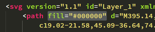
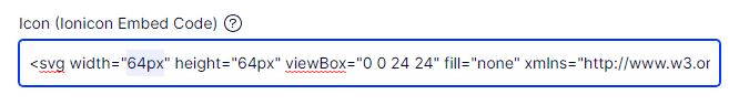
- Verify that
widthandheightattributes exist on the<svg>element and contain appropriate values for the area of the site where the icon will display. Theviewboxattribute shows the value for the “artboard” size. To scale the icon up or down, maintain the aspect ratio of theviewbox. For example, if the icon is saved out at 100x125, theviewboxattribute should show0 0 100 125as the value so the icon can be scaled proportionally at the 100:125 ratio. Thewidthandheightdo not need to match theviewbox, but the aspect ratio should be maintained. Note that SVGs should not distort or stretch when scaling. - Some vector editing tools (e.g. Illustrator) add data that is unnecessary for the web. Copy the entire
<svg></svg>element and ignore anything outside of it.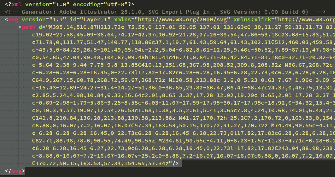
- Paste the SVG code into the “Icon (Ionicon Embed Code)” field and publish.
- If necessary, experiment with the
widthandheightattributes on the<svg>element to size the icon appropriately.